INSITE
Strategy, brand creation & design.
Bar Chef Project Brand & Label Design
With every project or brand we work on, one of the first things we do is identify the challenges for the future brand. What must it overcome? What is the deep value of the brand and product that might not be easily understood?
When we were asked to create a brand for Bar Chef, one of the world’s most innovative cocktail artisan’s and cocktail experiences located in Toronto, we quickly identified that the challenge was that this product was very premium offering within a new category that didn’t currently exist in Canada or more importantly, within the rigid categories of the LCBO, Ontario’s single alcohol retail source.
Who cares? Well the issue is, if there isn’t a category, the product would risk either A. not being sold in that retail chain, or B. listed and placed on the shelf within an incompatible category that could taint the brand’s position and diminish sales.
Bar Chef was producing an exquisite version of the “Old Fashioned” cocktail. Every part of the cocktail was artisanal from the base whisky produced in Toronto by Stalk&Barrel to the botanicals, bitters and the local maple syrup.
We identified another challenge which was that the preconceived ideas of what the product was, laid within the audiences past experiences with pre-mixed alcoholic beverages. And these weren’t typically great experiences; generally low quality sugary drinks consumed by young and price sensitive audiences looking to consume in quantity or without any discerning care for quality.
The audiences we needed to attract were those already interested in the growing cocktail culture but who might be without cocktail preparation knowledge, or without a home bar stocked well enough to attempt complex cocktail themselves or the already engaged in premium cocktails but looking for the elevated experience that can come from an artisan.
What this product was attempting to be was a finished object. Complete. Not a pre-mixed set of ingredients assembled into a bottle, rather a definitive statement and opinion on the Old Fashioned. It was a “complete cocktail” in our minds and as such we established that term as the position of the brand.
The first step in the brand build was to get the entire team to agree that the product would only be a success if A. everyone agreed to only refer to the product series as “Complete Cocktails”, and never “pre-mixed” or “ready made”, or “convenient” and B. To encourage the media and retailer to also only think of the product as the same. We needed to create a new premium category by separating the Bar Chef creation from the down and dirty pre-mixed field. To carve a new space with hopes that the shelf category would back fill with other sophisticated and premium offerings.
The next challenge was that the brand was a collaboration between two existing brands — Bar Chef and the Toronto Whisky Distillery Stillwater who would be supplying their Stalk & Barrel Red as the base for the cocktail. Both of these brands needed to be represented on the packaging and within the brand architecture.
Problem with a brand with multiple principals is that it can often be confusing and diluted in voice. So attention was needed to ensure the brand would be strong, confident and clearly demonstrated in terms of emotional value to the audience without the noise of multiple brands screaming over one another.
What we were able to convince the team of was that the creative source is the asset and so should always be the emotional lead. In this case Frankie Solerik from Bar Chef was the emotional asset since he was the artist and creative mind behind the cocktail. That suggested that the S&B branding position needed to be diminished since most people wouldn’t really be all that concerned with that part of the ingredient list as long as they knew it was also craft.
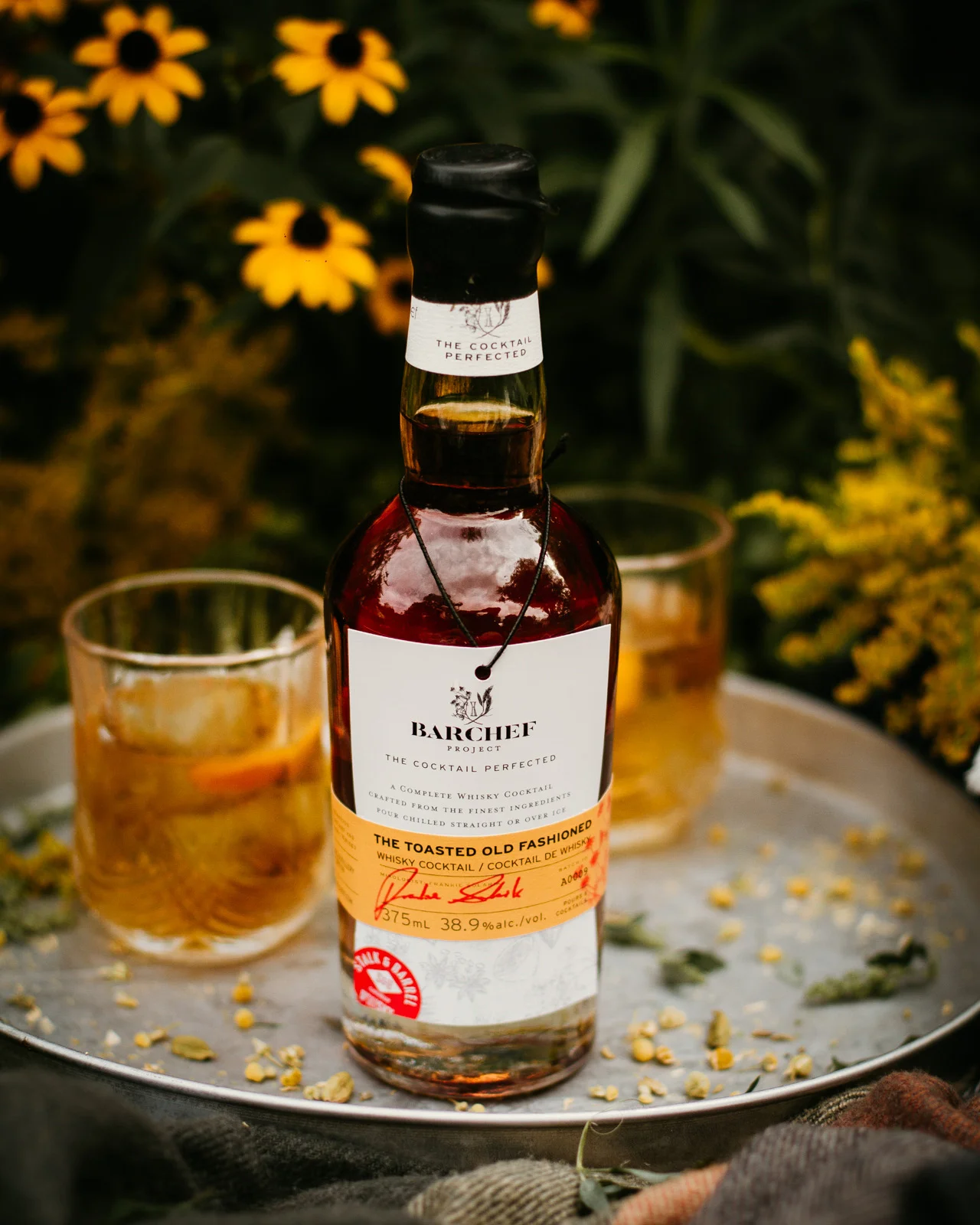
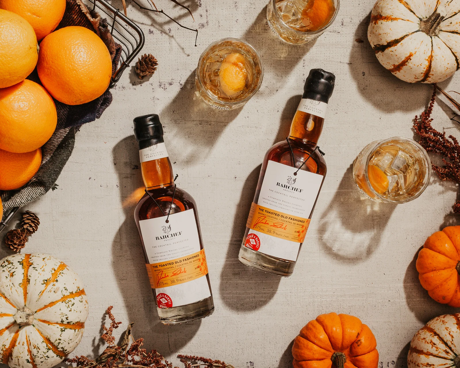
Following this decision on architecture we designed the label and package program to stand out from the typical offerings on the shelves — to sit within a craft and hand spun genre but to also be able to be produced at volume. The package needed to feel ultra premium to match its price point as well as to be flexible to roll into a series of products once the initial success proved worthy of more cocktails.
The result is recognizable and in itself a tactile experience to handle and open.
The front label is not glued to the glass and can be removed by ripping the yellow band. Once off, the user can read the reverse side of the front label to learn more about the project and people involved.
Images Credit: Leanne Neufeld

